The Power of Visual Triggers
Your brain is wired to respond to environmental cues. When you see your running shoes by the door, you're more likely to go for a run. When vitamins are visible on the counter, you remember to take them. This is implementation intention in action—a proven psychological technique that increases follow-through by up to 70%.
The key difference from app notifications? Visual cues are passive. They don't interrupt. They don't demand. They simply exist in your space, ready when you are. No screen required.
Strategic Visual Cue Placement
Morning Hydration
Place your water bottle next to your coffee maker. You'll see it first thing and automatically drink water before caffeine.
Evening Reading
Leave your book on your pillow each morning. When it's time for bed, you'll naturally pick it up instead of your phone.
Medication Reminders
Store vitamins next to your breakfast bowl. The visual association creates an automatic routine.
Desk Posture
Stick a small colored dot on your monitor. Each time you notice it, check and correct your posture.
Gratitude Practice
Keep a gratitude journal on your nightstand with a pen on top. The visual prompt encourages nightly reflection.
Healthy Snacking
Place a fruit bowl at eye level in the kitchen. Hide less healthy options. You'll naturally grab what you see first.

The Sticky Note Strategy
Sticky notes are your analog push notifications—but better. Unlike digital alerts that interrupt your flow, sticky notes wait patiently for your attention. Use them strategically:
• The Mirror Message: Stick affirmations or habit reminders on your bathroom mirror. You'll see them during your morning and evening routines.
• The Door Reminder: Place notes on doors you use frequently. "Did you pack your lunch?" on the fridge. "Stretch break!" on your office door.
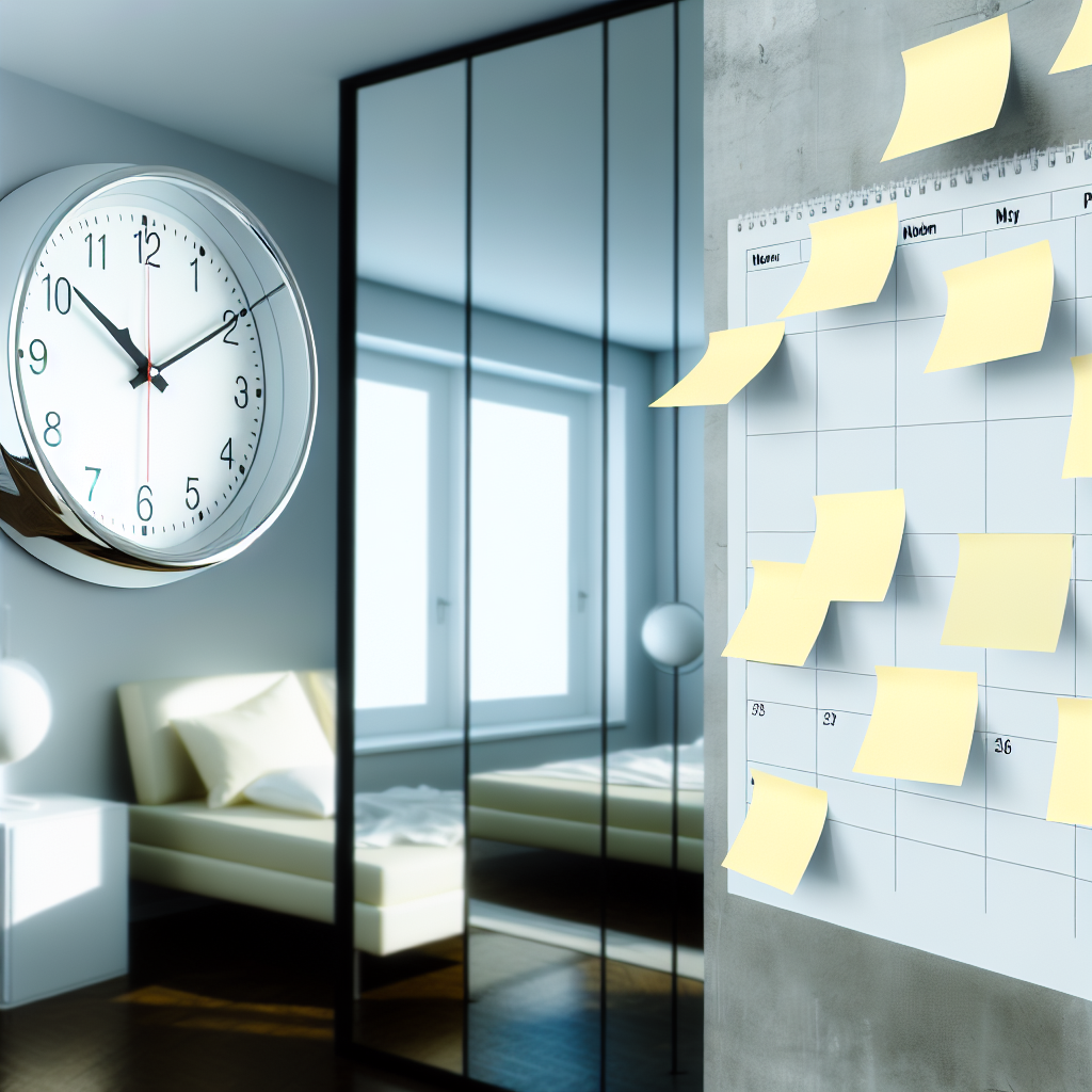
• The Calendar Anchor: Create a physical monthly calendar on your wall. Mark important dates with colored sticky notes for visual priority.
Pro Tip: Color Coding
Assign meanings to different colors. Yellow for habits, pink for urgent reminders, blue for motivational quotes. Your brain will learn to process them differently based on color alone.
Making Visual Cues Work Long-Term
The danger with visual cues is adaptation—your brain starts to ignore them. Combat this by:
Rotating placement: Move your cues every 2-3 weeks. The new location catches your attention again.
Refreshing messages: Update the content. "Drink water" becomes "How hydrated do you feel?" The novelty reengages your attention.
Seasonal updates: Change colors or styles with the seasons. Winter blues, spring pastels, summer brights, autumn earth tones.
Remember: The goal isn't to clutter your space with reminders. It's to strategically place exactly the cues you need to support the person you're becoming. Less is more—choose intentionally.